2018
Conservation Guide
Award-winning marketplace for quality conservation experiences
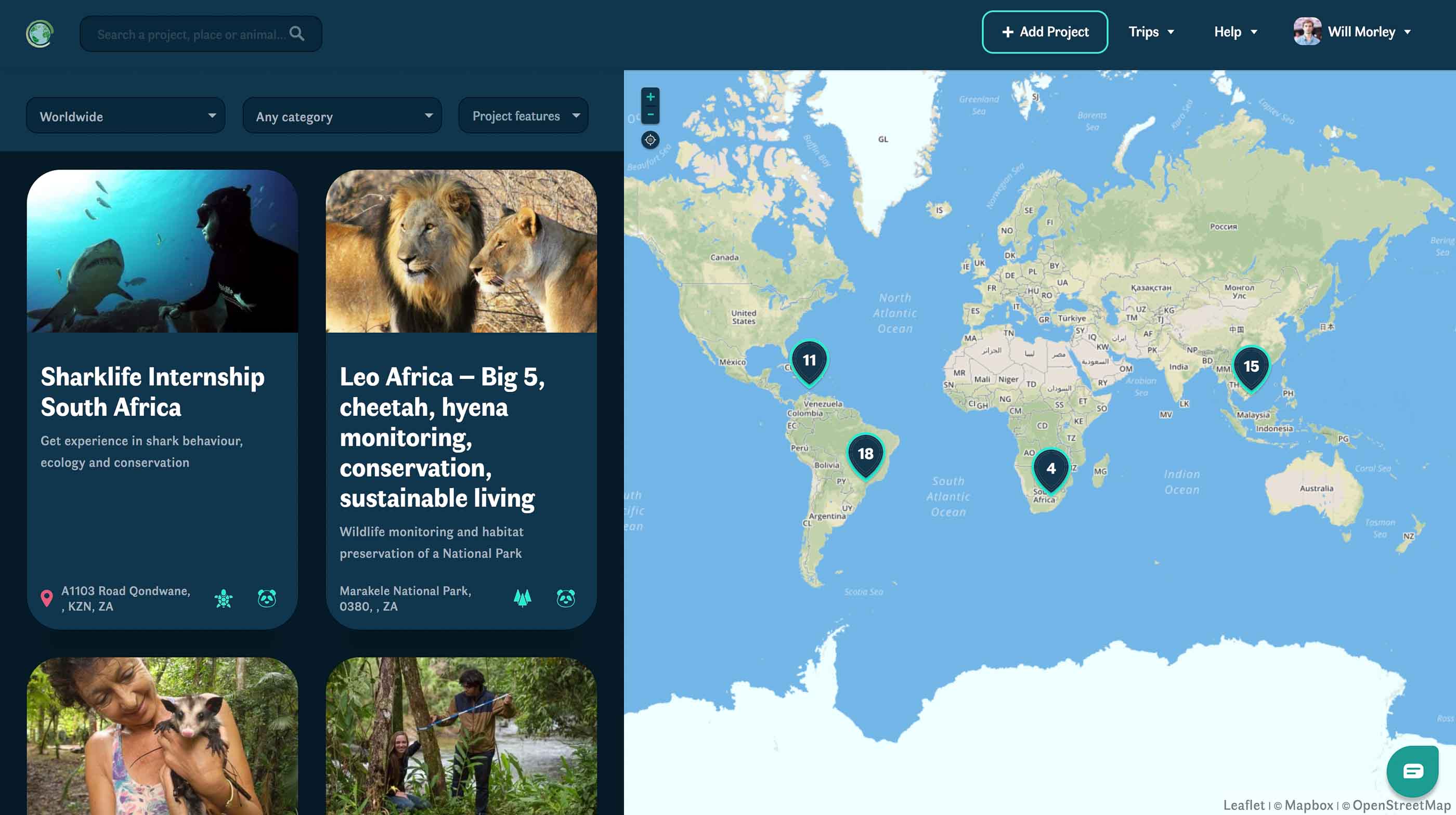
Conservation Guide is a marketplace for quality conservation experiences.
Aimed at tackling global biodiversity loss, the platform allows conservationists to find find and book quality conservation experiences around the world.
In September 2017, we won $18k seed investment from global co-working startup Wework to take the project further.
I co-founded Conservation Guide with my friend Justin in 2016.
- Search, upload, review conservation experiences worldwide
- Apply and pay for bookings directly with organisations
- Featured on the Webflow Showcase!
- Live chat and customer support pages
- Built with Webflow, Wordpress & WooCommerce


UX Design
Our approach started with looking for test subjects from our 20k facebook following. We managed to recruit 100 testers into a Facebook group, where I could post the latest updates on the project and items we needed feedback on.
For added motivation, we decided to reward each piece of feedback with a tree planted in the tester's name.
We eventually migrated committed testers onto a mailing list of 20 people because engagement proved to be very low over Facebook.
Anyway, our work began by breaking down our potential users into six personas, of which three were primary users, including:
- University student
- School student
- Career break volunteer
- Conservation project coordinator
- Training course organiser
- Parent of volunteer
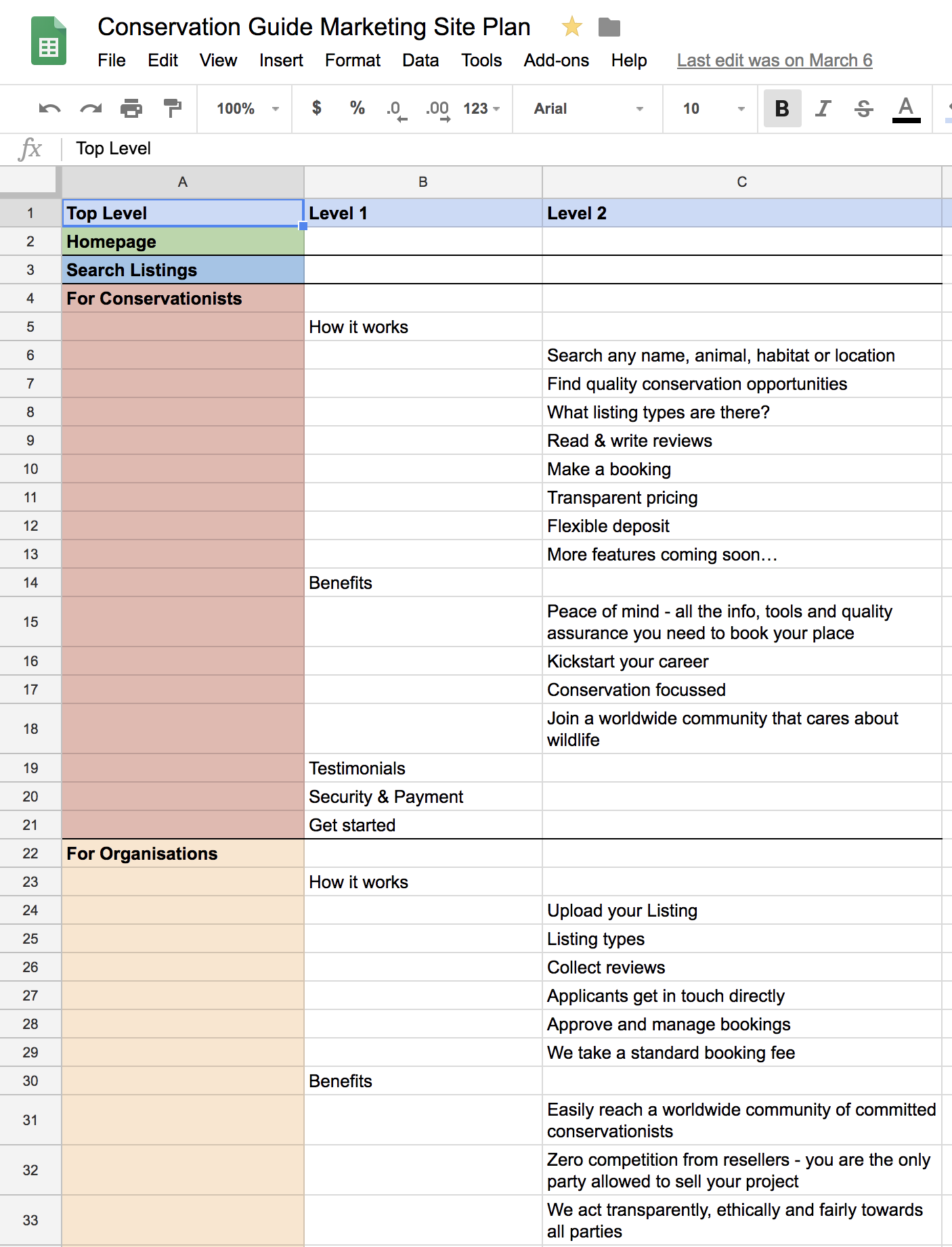
We then used the insights from this to design the information architecture of the site. We put this into a Google Sheet and shared with our testing community so that they were able to comment with feedback and even copy the plan and rearrange the content.
Web Design
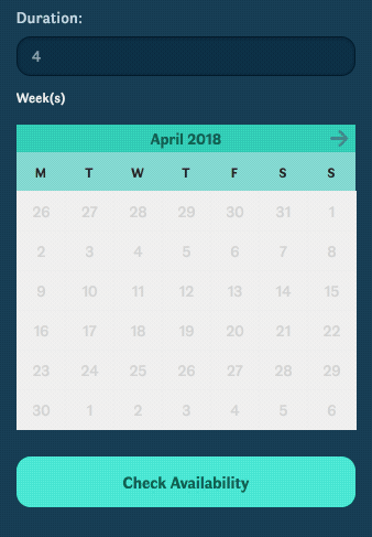
Once the UX work was completed and we had a solid site plan, I could make the initial wireframes:
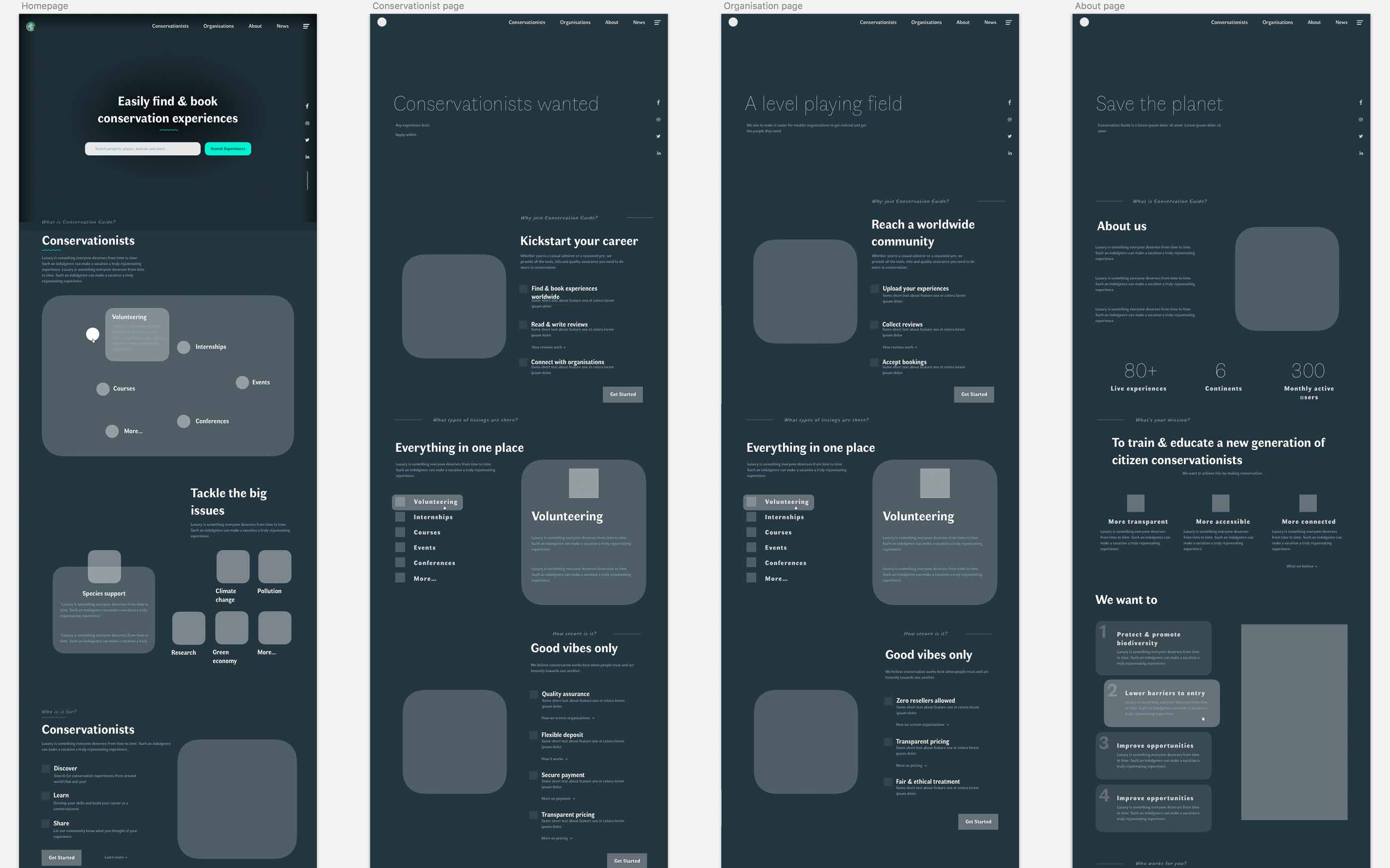
This was quite revealing as we soon realised we had quite a few different pieces of information and needed to find the most appropriate way of representing each of them without overwhelming the user. One example was: how to show our company goals, compared with how to show the different types of listings on the site.
At each stage of the design process, we circulated the designs with our testing community and got their feedback.
UI Design
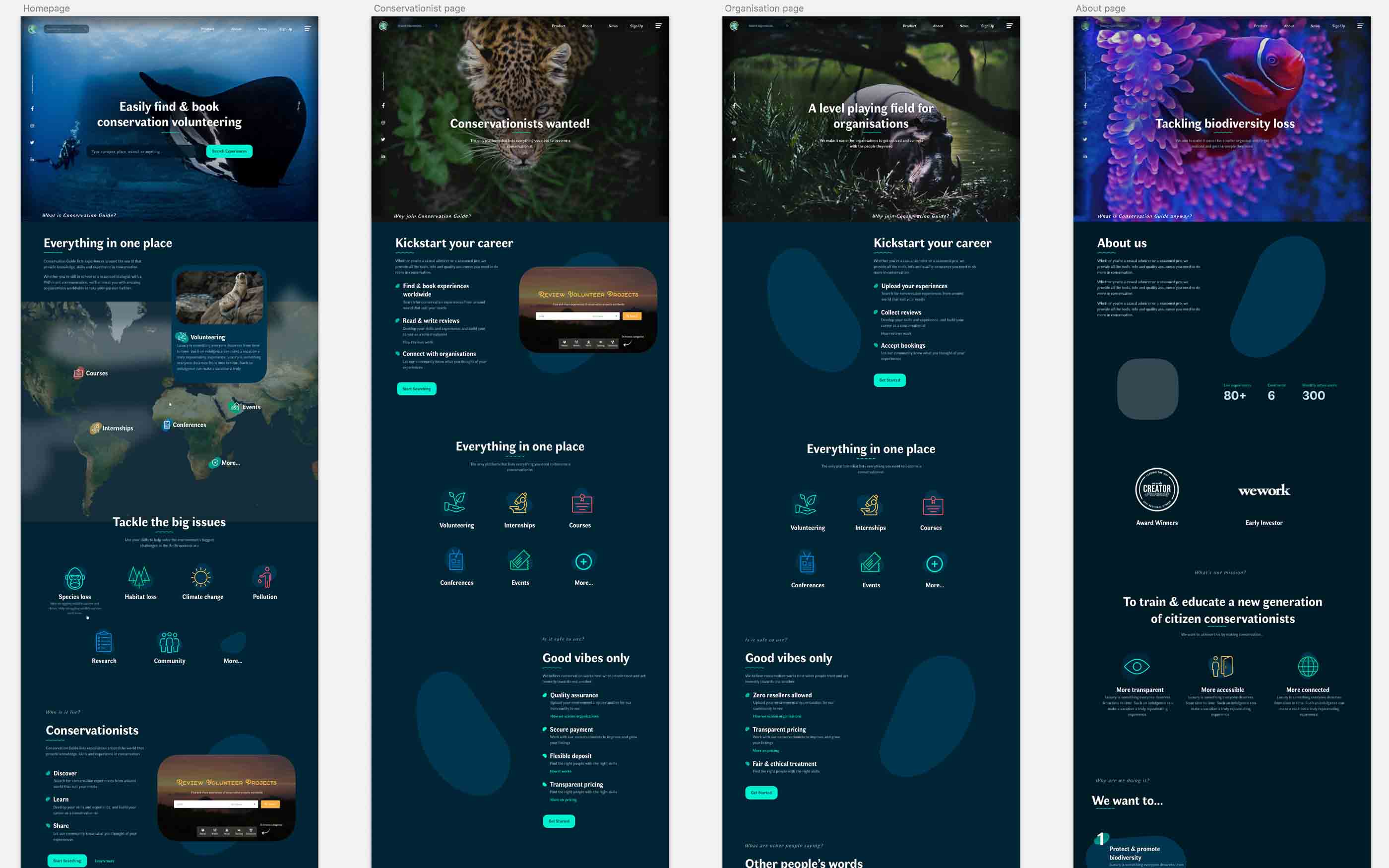
Given that the ocean is my passion and I was my own client for this project, I had a lot of fun with researching different themes. Eventually, we settled on the theme of deep sea bioluminescence because it afforded a striking dark interface that differentiated us from the competition completely. We had learned from research that almost every single eco company uses green, so we decided to make that the one colour to avoid at all costs.
The dark interface took some experimentation and user testing to get right - e.g. getting the correct contrast between text and backgrounds, but now it strikes the perfect balance between legibility and darkness.

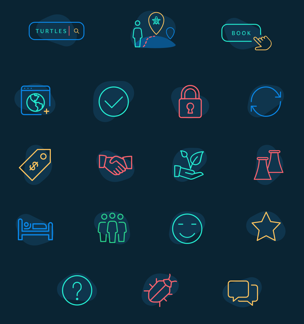
I also designed an icon set using some off-the-shelf icons. I would have made my own from scratch, but I could not justify spending more time on the icons than designing and developing the larger site.
Development
I'm now very experienced with Webflow, its strengths, and its limitations, so it did not take long to get the site up and running. Since our 'web app' part of the site is build with Wordpress, I moved this to a subdomain and set up the Webflow marketing site on the main domain.
The Webflow search forms pass through the search request to the Wordpress site so users can start searching instantly from any page.
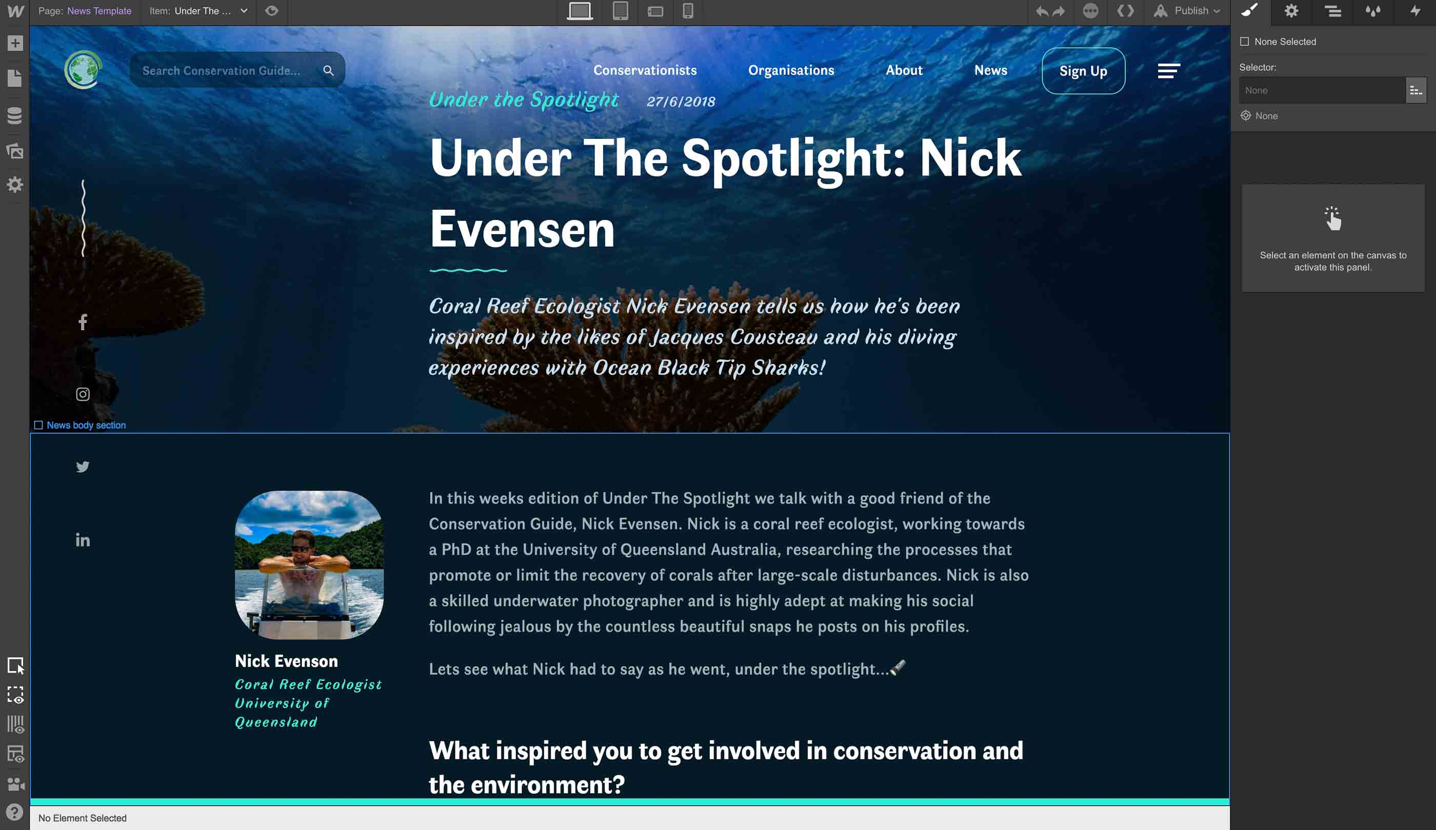
I set up the site so my our CTO Justin, a non-technical person, was able to easily add blog articles and edit the site content without my intervention. This has proven to be incredibly effective for our content marketing strategy as we can now publish around 2-3 blog articles per week.
I was able to set up a 'Help Centre' where we can quickly and easily post answers to customer service questions. For a company with only two people, this kind of scalability is incredibly important.
Finally, we integrated various marketing tools, such as Mailchimp, Facebook pixel, live customer service chat, and Heap analytics so that we could gather relevant data on site visitors - with their consent of course!
Once the site was complete, we sent it out to our testers to play around with and we iterated on their feedback before launching.
Result
The new website was launched in April 2018 and has been a complete success for a few main reasons:
- We are now able to quickly and easily publish all sorts of content
- We have a much more professional image and company story to tell
- The UI design and identity can be adapted to create new pages, graphics and marketing material
The most striking metric to testify to our success is that we doubled monthly site visits in the three months since launch. This is because the Webflow platform has allowed us to produce and promote high-quality content very easily.
The site design and build was so good that it got featured on the Webflow Showcase:
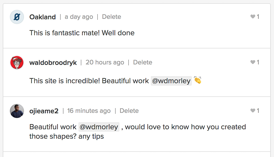 Nice to get some recognition from the design community too!
I hope to provide more updates on Conservation Guide soon!
Contact Me
Want some sensible advice?
I design & build web solutions where quality is a necessity, not a luxury.
will@wdmorley.com

Based in 🇳🇱 The Netherlands.